Wednesday, July 29, 2009

Assignment2 - Final

No different from the previous post but this will be the version I chose for ez-link top-up machine as it is easier for people to relate it to ez-link top up machine. :)


Your notion of colorful Asia… (Final)

Among the 9 different colours, this will be the final prototype. This is chosen because the red heading "Amazing Asia" is more attractive and is able to attract people's attention better. :D

U C What I C (Final)


Retook photo 1-5 and 7. Hope that its clearer now :)

iN2015 (Final)

I changed the tv abit to make it look more like a TV. I also rearranged the layout of the text slightly and also changed the logo of NUS.

Tuesday, July 28, 2009

Assignment 2 - Less is More (Pictogram)

OMG! I finally done with my Assignment 2! I really really had a hard time coming out with what pictogram to do for the NUS Community. To me, it seems that everything that needs a pictogram has been done!
 When I first presented my first "abstraction", I think its a super lousy work. Its not pictogram at all.. more like poster design. At that point of time I did the "mask abstraction" is because of H1N1 and I have no idea how to really do abstraction. haha! Below is the sketch of my first "pictogram" that I presented in class.

Monday, July 27, 2009

Assignment 6: Infographics (Edited-Final)


Here are the comments for the previous version from Jing, Sharon and Rayner:
- The infographic is very explantory. No need any text.
- switch the rooster and the hen cause hen lay eggs.
- at the end of the cycle, suddenly stop at the boy. Maybe should point it back to the chick so that the cycle continues.
- Make the boy a farmer with straw hats.


From the comments I got yesterday, I editted it accordingly and tadah! Here is my final piece! Presenting to you.. "Farmer and Chicken Relationship"


I change the title from "The Chicken Life - Happily Ever After" to "Farmer & Chicken Relationship" because I find it more suitable in this editted version. :) I also added in food for the chick to eat to show that the farmer feeds the chick... :D Okay thats all!

Thank you!

Sunday, July 26, 2009

Assignment 6: Infographics

For this assignment, we need to come out with a infographics about "How system works/How things work". We can do it in any size we want as it is the last assignment! YAY! lol! It took me quite awhile to think of what to do. The title might seems easy but even if got idea also need to thing of what to draw! Its quite challenging for me la. lol! I sketched out 2 work and presented in class.

The first sketch is about split brain. I got the idea when I am reading straits time 1 morning and I find it quite interesting. So I decided to work on this idea. But after sketching, I found out that there is no sequence/chronological order.. Oh well!

The second sketch is about life from school time to exam time to after exam time and lastly working time. :D Half the circle will be 12 hours, the other half will be another 12 hours.

Sketch #1

Sketch #2


I decided to scrape the first 2 idea and come out with a new 1! :D
Here is the sketch~


Finally finish it but I'm not sure whether its okay anot! Meeting Jing later at 11am. hoho! Hope its okay! Here's my work... This is about the lifecycle of a chicken but in a extended way! It's call "The Chicken Life - Happily Ever After" because as you can see the rooster and the hen got together! So it's happily ever after! and next, the boy got to eat the chicken! So, its happily ever after again! :D Haha!


Thursday, July 16, 2009

Your notion of colorful Asia… (Colour Study)

Colour Study of my postcard. :D

Name of my postcard: "Amazing Asia" -- because I amazingly came out with this idea and colours! lol~

At first when I'm trying out the different colours, I find that they are quite ugly! REALLY! haha! Some even give me the feeling of very indian. The only one that I think was quite nice is first row right side. The pink+red+purple shades looks very pretty and sweet! :) But after looking at it for several time, I realise that all the 9 colour combination looks not bad!

Some colour combination that I play around with Redish (brown, red, orange combi), No red (avoid red colour), Earth tone, Whispering Colour, Shouting Colour etc etc.

Till now I still cannot decide which one shall be my final product. What do you think? :D


Colour Study:


Back Design:


Tutorial Comments:
  • Fulfill what the assignment is looking for.
  • Avoided black, is it on purpose? cause black is not asuspicious colour for chinese.
  • Pagoda can bec use as green.
  • Brush font is a good choice.
  • Is the building in the bg trying to show that modernization is destroying traditional buildings? (political)
  • Too focus on chinese but is it purposely focus on the chinese part?
  • Any reason why there is no detail on the pagoda?

Your notion of colorful Asia… (Idea generation + Sketches)

For this assignment, we need to come out with a postcard (both front & back) with size of A6. We need to do colour studies and also chose the actual design that we chose. This post card is to introduce and give impression of asia. For example, what is unique about asia? (Cultural, political etc). We can also complain about asia too. :D

I personally find that this assignment is quite tough because we need to play around with colours and also coming up with idea is also very difficult! I try not to touch on food, national flower, costume of various culture, landmark etc but abit difficult cause it seems like all this is the essence of asia. haha!

Anyway, my initial idea was to take photo of different races and piece them together but again due to time constraint, I have to scrape this idea! hoho! I went googling about colourful asia and most of them shows costumes and etc~ So this idea came to my mind.. "Cultural yet Modern".

I tried to convery my idea by drawing this asian girl desipte being cultural (the head with the chun-li hair style), asian is also modern by drawing modern clothings (The "bat man" shirt with "high cut short"). The ballon is being drawn in to show that asia is happy and fun! :D Next, I also drew this guy whose hair and looks look modern but is wearing traditional chinese clothes. After further look at the guy, I find that the guy's hair, face etc doesn't look modern at all! LOL! I got not much time left so I left out the guy and do a CG version for the girl. Its not sexist! haha!

Here are the sketches... :D

Sketch #1 - girl with chunli hair!

Sketch #2 - "modern guy"

Wednesday, July 15, 2009

iN2015: Tutorial Presentation + Comments

The CG version that I presented in class. I only presented #1 and #2 cause they looks better. :D

#1 - I call it "Connectivity"? lol! Got this idea when I was browsing magazine! haha! This is the advertisement by hardwarezone that inspired me! :D


Here i'm trying to show how this 4 item will soon became an important part of our lifestyle when they are all connected to the internet. Maybe not HOW but just show that they will soon become important part of our life in the coming years~
#2 - "Dr. Television" iN2015 would allows Doctors to monitor their patient's health and can even do a check up on the spot if needed. I think the design doesn't need much explanation right? Quite straight forward. Haha! I wanted to remove the the word "TV" but I that it looks quite nice. . Ummm!!! What do you all think? :D
#3 - "It's Only a Touch Away". The rather faded person is a hologram. Okay. I know it doesn't really look like a hologram. haha! This design shows that soon, we will be able to see hologram of the person who send message to us~ The "screen" that the person is holding is a piece of glass which uses touch screen technology. It can be folded and brought around easily. Got this idea from iN2015 video. :)
#4 - "Payment Made Easy" - My initial idea was a finger inside the reader. Then I think palm might be better as it is safer? I think? lol! I wanted to just put a the palm and the palm reader right in the middle BUT I got abit high doing the posters and also find it abit plain. So, I added in the monitor that shows transaction approved.

Overall, #1 and #2 is my favorite. Haha!
Doesn't really like #4. Duno why also. Haha!
Yay! That's all! Thanks for viewing!
Time for bed!


Comments during Tutorial:
  1. #1 doesnt shows connectivity. Can show it by putting the "wireless" signal logo(1 stick with wave~) or like what Alfred has commented, put network node etc.
  2. #1 - the weblink can be closer to the main tagline.
  3. NUS logo seems too big. Should be 5% of the poster and should also show Communication and New Media.
  4. The class agrees that #2 is nice. Able to directly communicate the idea clearly~ :D

Class Exercise C

So last Thursday during class, jing ask us to pick 2 words from the list below and use basic elements like dot, line, shape etc to create 2 abstract or semi abstrat images converying the meaning the word chosen. It can be done either hand drawn or CG and the size is A6. As this is a group activity, I pair up with Jiang Yang and we chose the word POWER and CALM. Here are the drawings..

Power


Calm - When the sea is calm, we can fish! and birds will fly happily cause of calm sea~


Oh...I was telling him that we can show quiet by submitting a blank piece of paper!! HAHA! oops. =/

Sunday, July 12, 2009

iN2015: Sketches

For assignment 4, we are suspose to do a poster in A3 size that would create awareness for iN2015 aka Intelligent Nation 2015. It's a brand new idea by Jing and it's rather tough to come out with ideas for this poster. First thought after watching iN2015 video in class was minority report style poster. But after further consideration, I drop the idea cause it's rather complicated to do. Oh well!

Anyway, here are some ideas I came up with after reading and researching about iN2015. Hoho!
Came up with several sketches! :D

Sketch #1


Sketch #2

Sketch #3

Sketch #4
Sketch #5
Sketch #6
Sketch #7

Further developed 4 of them into CG! :D
See next post for the CG version! :D

Thursday, July 9, 2009

U C What I C (Presented in Class + Comments)

Here are the 8 photos that I presented in class! :D Enjoy~

#1
#2
#3
#4
#5
#6
#7
#8


Full Story

Tutotial Class Commentsss:
  1. Photo1 doesnt look like mickey is hungry. -- ya i agree with this! will improve on it!
  2. Photo2 the mickey looks evil! Maybe can crop and show only the eyes part. Cut away the ears.
  3. Photo3 doesnt show its an illusion. -- For this photo, I'm trying to create an illusion that shows that it looks like a dog butt and at the same time looks like a pau to mickey~
  4. Maybe Photo4 can show like photo3 but without the pau look so that people will know that its the same thing that mickey is bitting.
  5. Photo5 - Do not know whether mickey is shock or full after eating the pau.
  6. Photo7 looks like an evil character suddenly appear.
  7. Photo7 and 8 looks like a separate story. The part where mickey is hungry is gone.
  8. Continue the hunger story
  9. Arrange of the 8 photos should be consistent. Suddenly changing the direction where the story flows put stress on the viewer.

U C What I C (Sketches)

For this assignment, we are suspose to tell a story in 8 photos without using any words to describe the story! hoho! It can either be with a twist or without a twist~ :D And amazingly, I came out with this story when I was hungry again. -.-"

Initally my idea was to ask one of my friend to be my "model"... but due to time constraint and etc, I decided to change to a non-living object. haha...


As I cannot find a human being to be my model, I uses my toys~ Haha! Thus, I changes the story abit...


Here's the story...
There is this person who is very hungry and some time.
He finally see something that looks like a gigantic big "pau".
He went over and bite it!
On biting it, he realise that its not a "pau"...
He got a shock of his life when he finally realise that its not a "pau" that he has bitten. It's a giantic monster.
He ran as fast as he could away from the monster.
Suddenly came this dark fairy who help him escape but turning the monster into a miniature monster~ hoho!

Sunday, July 5, 2009

Assignment 1b - Me, Myself and I (CG) - Final

From the comments I got during class, I came up with a final piece. :D

Assignment 1b - Me, Myself and I (CG)

Actually the most important reason why I use the sushi sketches is because its simpler. I tried to draw the one for tooth decay but abit I find it not very nice and very hard to show the idea.

Tooth Decay:

Here are the 3 CG of my sushi sketches i show in class last Thursday. Hoho!

Overall Comment:
Colours are attractive. YAY~ :D

#1:


During tutorial, I presented #2 before #1 cause I sent #1 to my friends and they can't see my name. So I came up with Design #2 with mini onigiri to form the letter "A" hopping that my name will be clearer. Suprisingly, the class says that they can see my name in this design with only 1 onigini to represent the letter "A".

Comments from tutorial:
  • Most of them prefer this.
  • They feel that its nicer.
  • Just have to close up the gaps for "T" and close up the chopstick.
  • Zhi Xiong commented to have the 6 maki replaced. (I like the maki alot! So, I think I will not replace themt. :D )
  • lower the saucer
#2


Comments from tutorial:
  • Onigiri too small?
#3


Comments from tutorial:
  • The letter "A" and the soy sauce looks forced.

Assignment 1a - Me, Myself and I: Tutorial Comments

After tutorial last Monday, here are the comments from the class~


The lines for Rough Sketch #2 is distracting so its kind of extra.


For the lolipop design(Sketch #4), eeling commented that maybe can have the wiring thing for the sweet wrapper to complete my the rest of my name (-ricia)

Before:

After:

Added the wrapper and the rest of my name in. :)

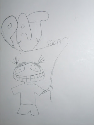
Next, as my name is just written on the paper bags for the shopping design (Skecth #3), its does not meet the requirement or something. So, a few of them commented that maybe can have decay teeth to spell my name out or have ballons with my name.

Before:

After (Tooth decay):


My decay name! Patty. :)

After (Ballon):


After drawing the skecthes of what others have commented, I came out with a few more NEW skecthes myself.


New Sketches #1 (my loves):

The sketch above shows clothes tag, shirt, pant..etc. The face spells i-c-i. Can see? After drawing the face, i realise that i miss out a R infront and i dun have anymore ideas about what to draw for the last letter A. haha!

So, i redrew it...
The R is make up of a bangle and a necklace.
The A at the end is make up of watches.
:)

New Sketches #2(Sushi):
The inspiration came when I'm hungry! HAHA! Below are the sketches...


And so, I decide to do the final one in CG using combinations of sketchs i drew in New Sketches #2 because I loves how the sushis spells out my name! haha! Not only that, the vibrant colours of sushi also shows my love for bright colours! :D Lastly, food makes people happy! woo hoo!